TFS
Branding // Print // Social Media // Video editing // website design & development
The work displayed here was produced during my employment at Famous Wolf. It is featured in this portfolio with express permission. All rights, including copyright, are held by © 2026 Famous Wolf Group Ltd. All rights reserved.
The bricks, and the mortar.
As Head of Creative at Famous Wolf, I worked extensively with Tamworth Financial Services, a Mortgage Advisor based in the West Midlands. I led and executed a successful rebrand, redesigned their website, supported the marketing team with social editing and produced their printed marketing apparel.
Social Media Video Content (Click for Visual Description)
Visual Description: Four muted social media 9.16 videos of the client. These are PTC examples of content.
A fresh lick of paint.
The successful efforts in developing TFS’s social media fostered significant client trust, leading to the next strategic step: brand evolution.
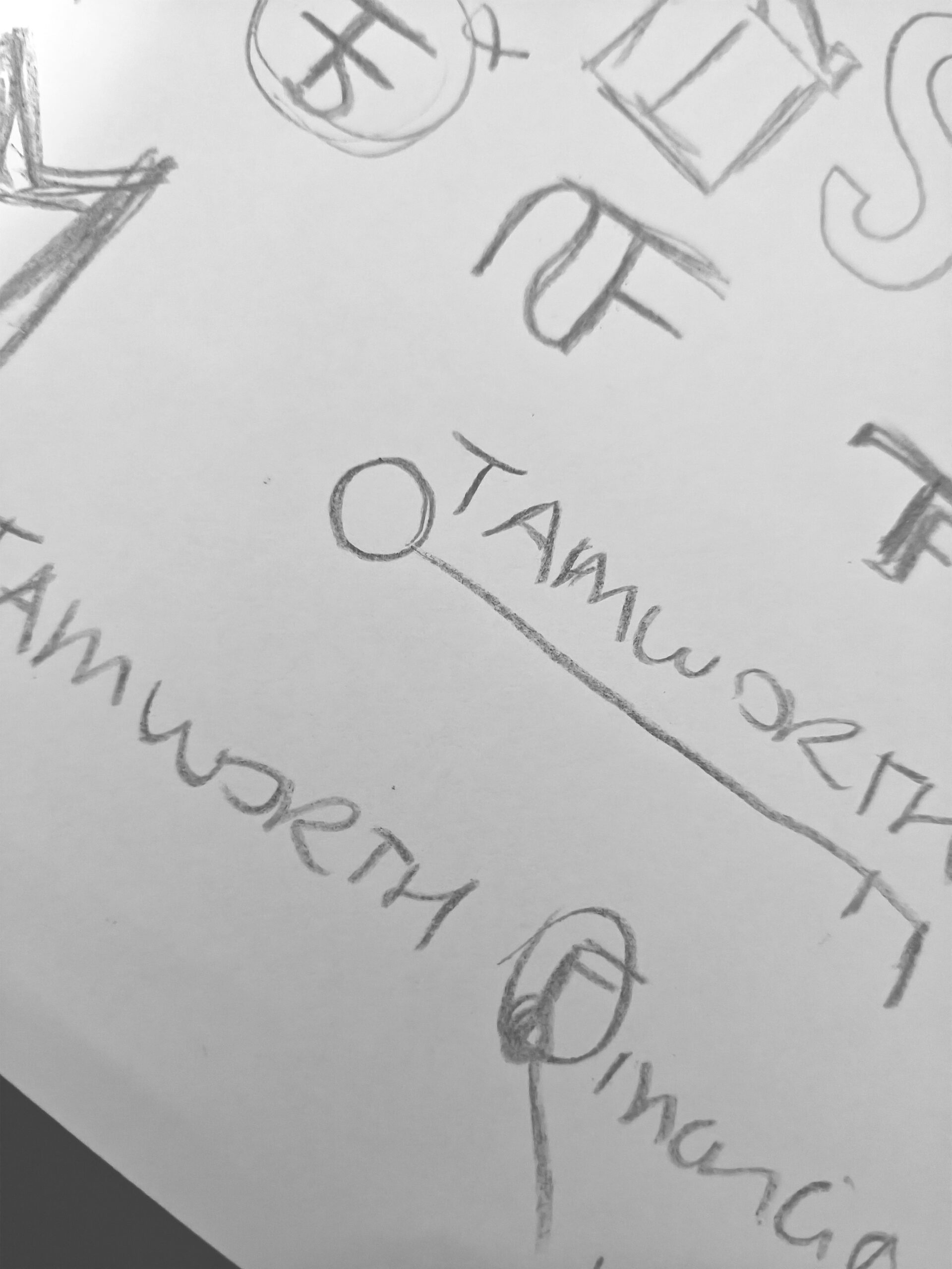
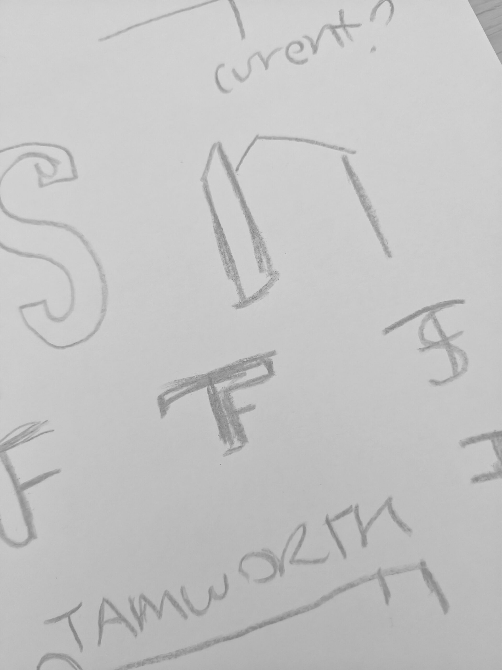
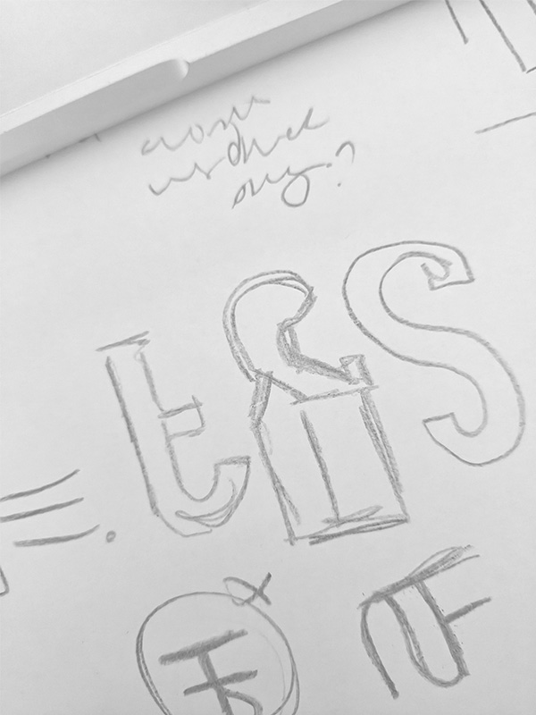
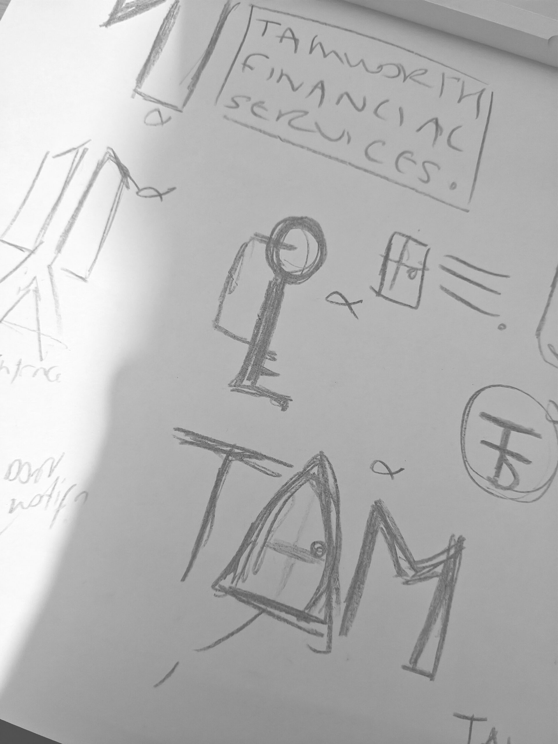
Logo Ideation (Click for Visual Description)
Visual Description: Four images from left to right show rudimentary ideation in the form of thumbnails and sketches. These range from using keys and doors as motifs within the typography, as well as experiments with the old logo shapes to have some form of legacy from the initial design. These ideas were scrapped in favour of simplicity with the logo’s semiotics.
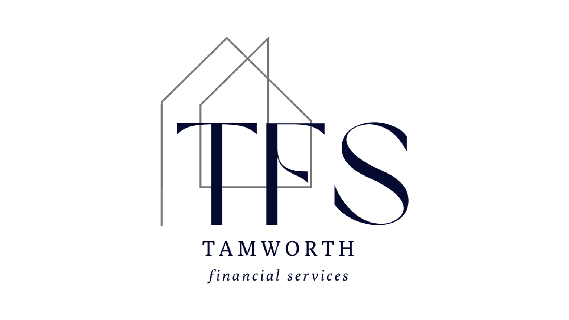
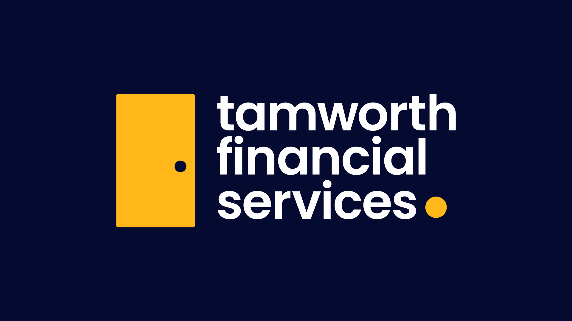
Old Logo Vs New Logo (Click for Visual Description)
Visual Description: The first image presents the old logo, a serifed abbreviation wordmark with lines running through it. The wordmark has a triangular thin line running through it. The second image presents the new logo, a door motif in yellow to the left. The name of the company is presented in lowercase sans serif font. A yellow, emphasised full-stop sits at the end. The words are stacked.
Early in the project, I decided that the brand refresh and website redesign should be developed in parallel. I knew the design language of the rebrand would impact the visual language of the website. The client also had a short 3-month timeframe for completion due to the need for approval by a third party PRIMIS Mortgage Network before the new financial year.
I started by using a Gantt chart for detailed time planning, specifically to ensure the project was realistic without overworking the developer I was responsible for. By using a Gantt chart I could effectively compare the project to tasks that were also assigned in this timeframe.
After this process I moved the project to Asana and employed an agile workflow to hit all our goals.
The branding process began on paper and then moved to the PC. I always knew I wanted to get rid of the Serifed font as it implied a more corporate feel that the brand was no longer synonymous with.
I chose a simple door for the iconography, reflecting the industry and the ‘when one door opens’ symbolism, but a lowercase sans serif word-mark tied it together, feeling friendly and less corporate. The full-stop adds a finality to the design that implies expertise.
The web design process went from hand-drawn wireframes to Figma designs. We showed two homepage options to the client before building a full mockup and starting development. I decided to finish the rebrand first because I knew it would directly affect the website’s look.
I also supported the website’s development, especially for the web-tools that needed complex math and logic. As the developer had difficulty in this process, I built a spreadsheet to show the logic for each equation such as a stamp duty calculator. Then, I used Gemini AI to convert this logic into code, which the developer then used as a guide to write the final code for the site.
Final Website Redesign (Click for Visual Description)
Visual Description: A laptop floats and bounces lightly. It is set in front of a blue gradient background. It features on it a screen recording of the live website.
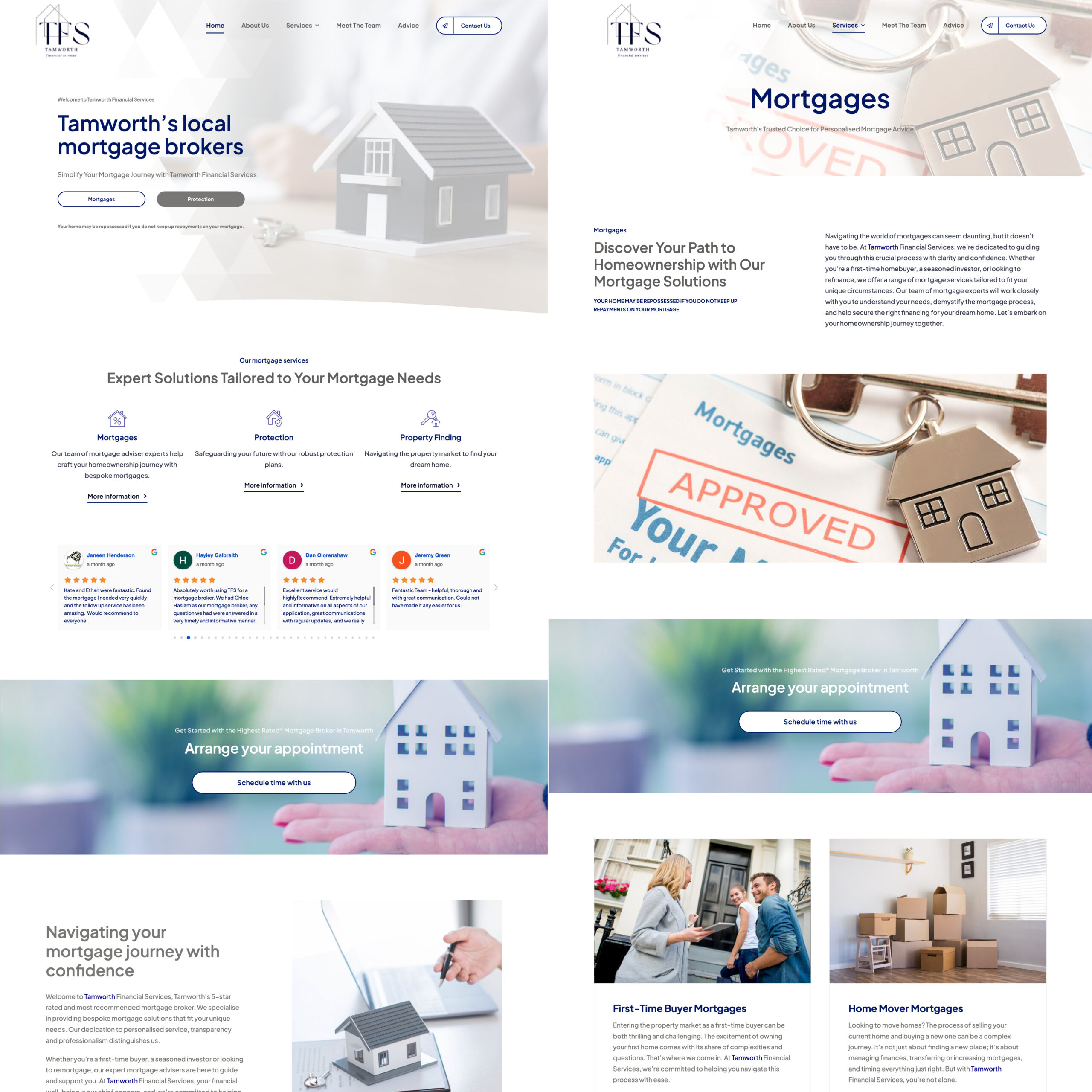
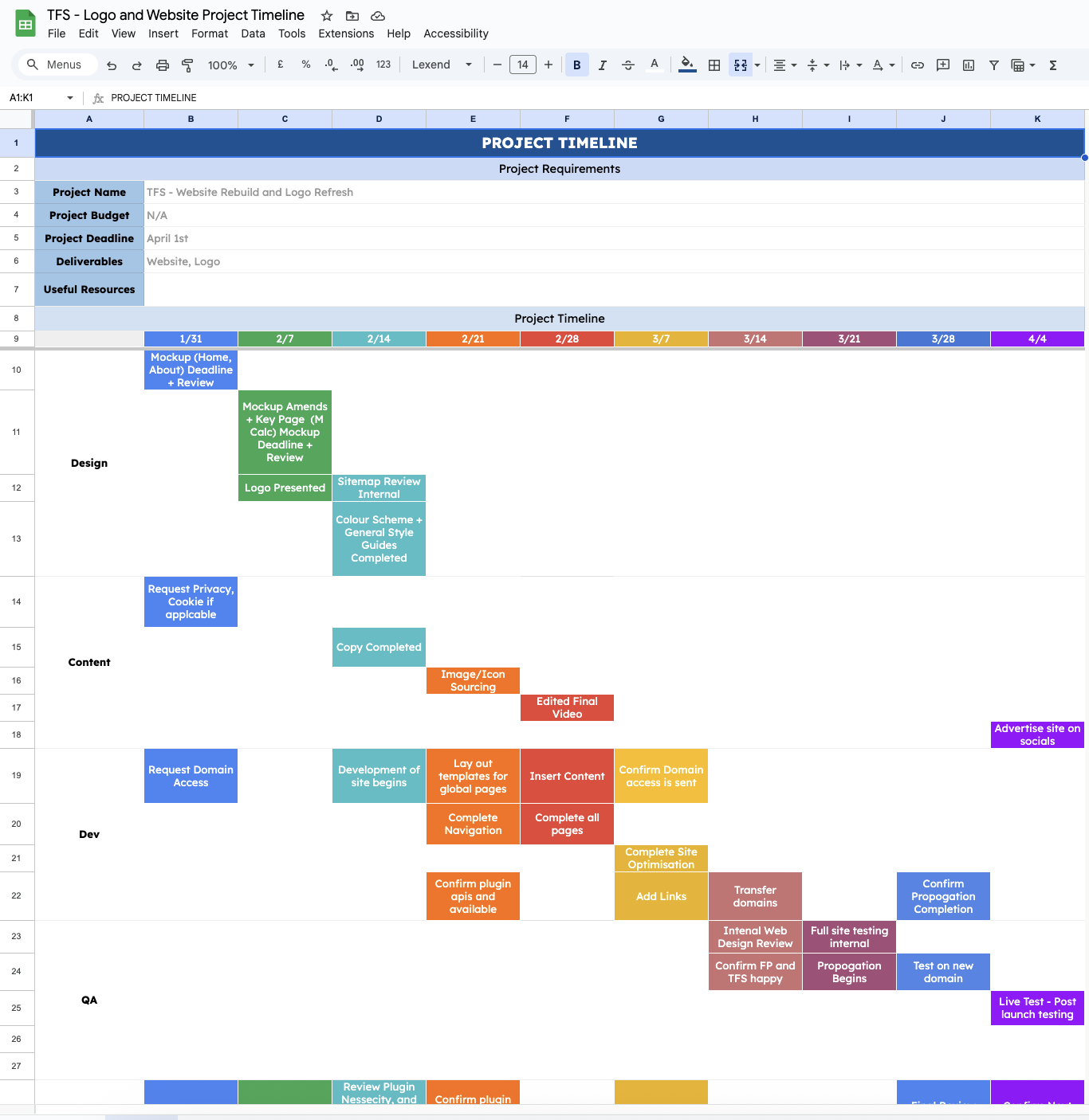
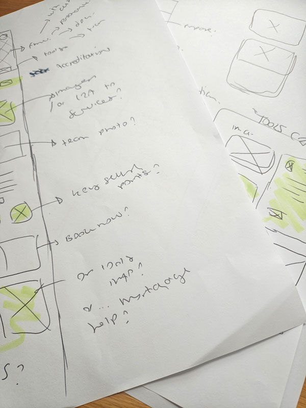
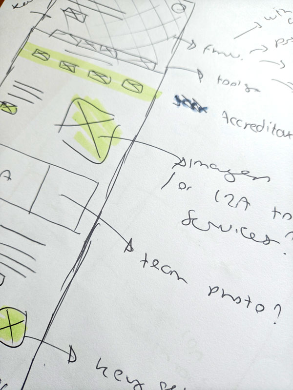
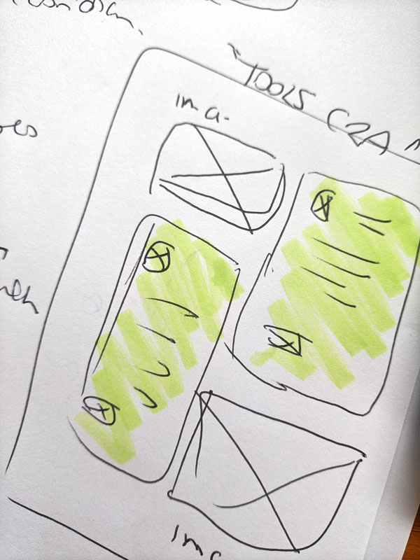
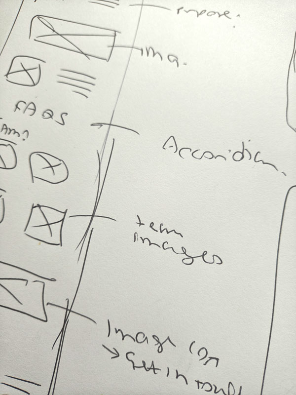
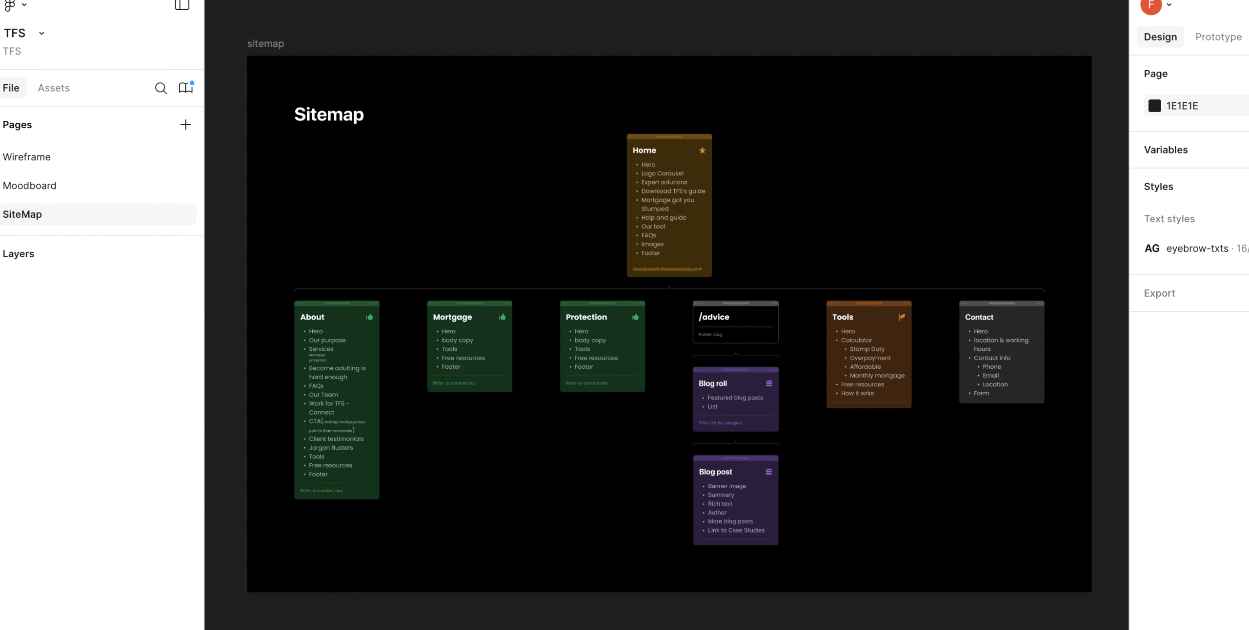
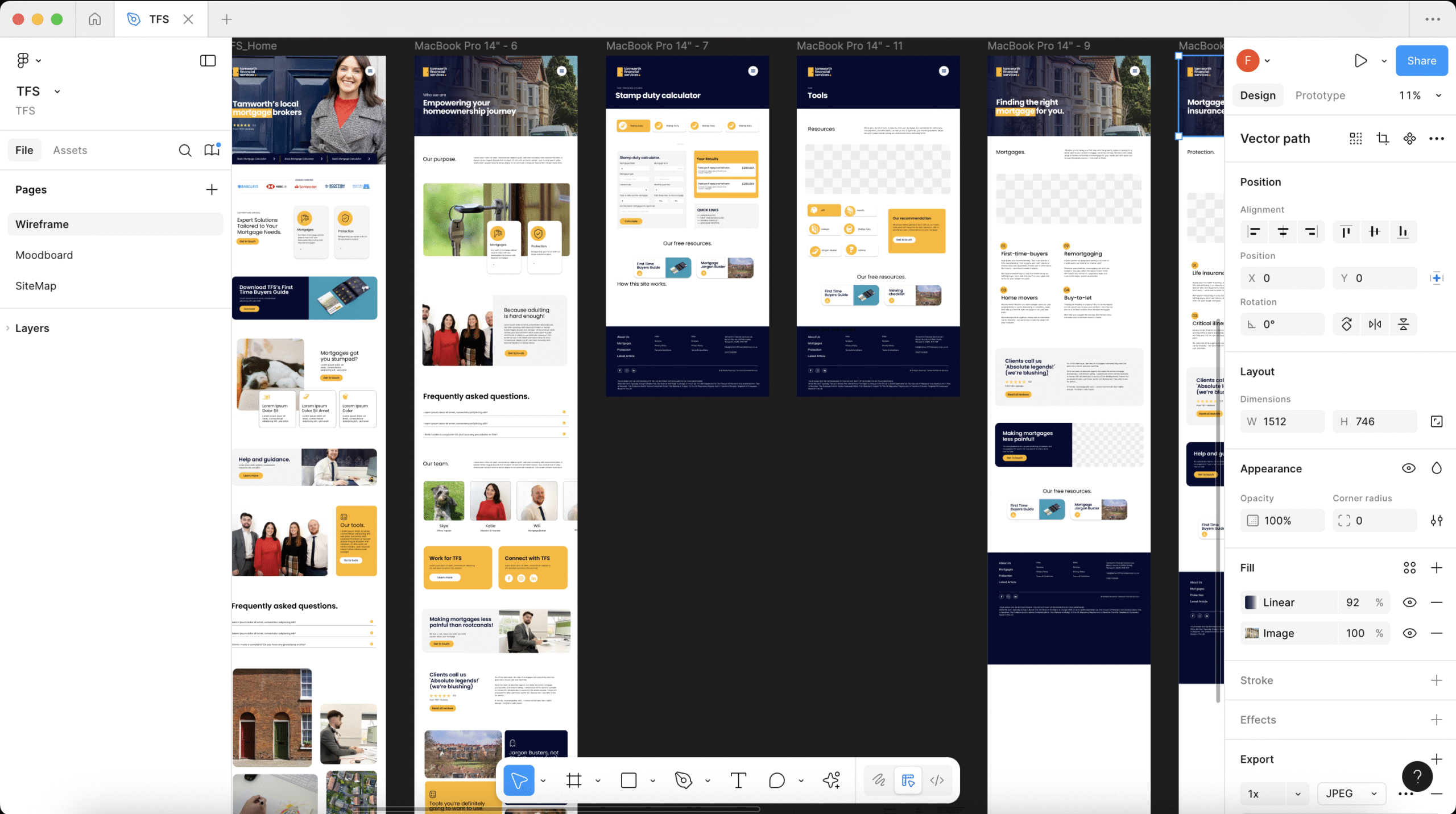
The Website Design Process (Click for Visual Description)
Visual Description: These images showcase the website redesign process. Starting from rom left to right, we see a screengrab of the old website design, then a gantt chart showcasing timelines, then there are four images of wireframes with notes and sketches, then there is a screengrab of the website sitemap before finally showcasing the Figma Mockup of the site.
Print it out.
For Tamworth Financial Services’ brand, I’ve created various marketing materials, such as a Sales Folder, a first-time buyers’ guide, a square bi-fold introduction for viewing homes, and viewing checklists.
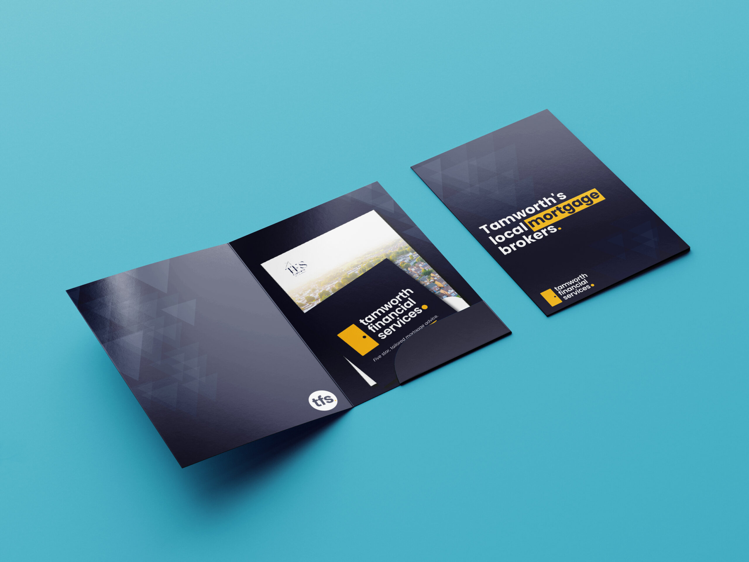
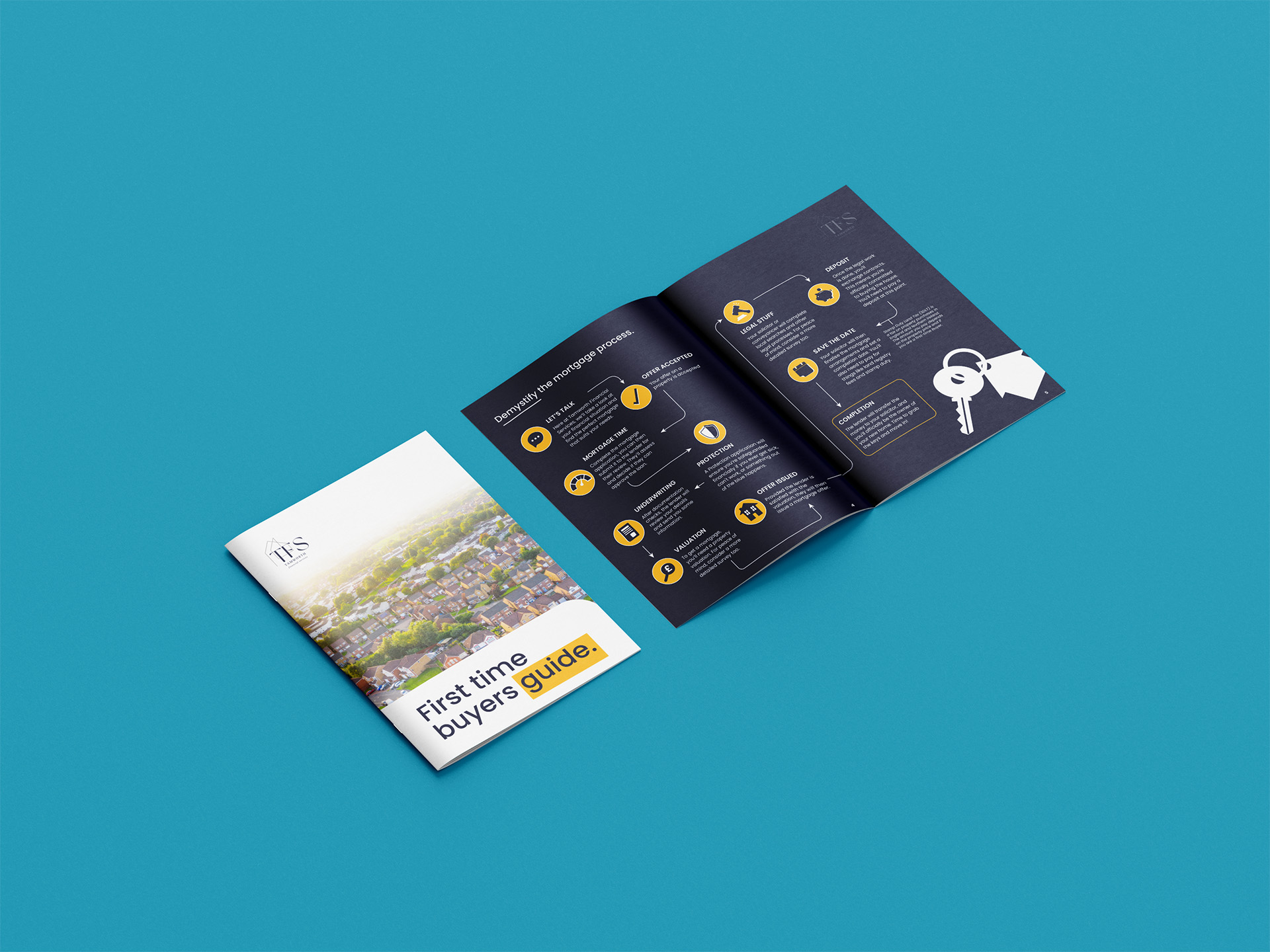
Printed Work (Click for Visual Description)
Visual Description: These images showcase print design for this client. The first image showcases an A4 Sales folder. Within it is a sqaure bi-fold and the first time buyers guide. The second image shows a First Time Buyers Guide.